
The Challenge
This prototype for a new mobile app was developed in a two-week design sprint within the context of the General Assembly User Experience Design Immersive program. As a team of three, we were asked to respond to the following hypothetical challenge:
In November, the U.S. will hold a particularly consequential midterm election during one of the most divided times in recent memory. FiveThirtyEight.com is owned by ABC, and both companies have an interest in informing the public of upcoming election data. They want to create an app specifically to inform voters of their elections and ballot measures, as well as help them vote.
My Role
As the designated research lead, I…
Performed competitive and comparative research
Developed our survey and conducted user interviews
Synthesized results and shared findings with my team
Built personas, user journeys, and task flows
Performed usability testing and shared my recommendations
Designed and shared a presentation outlining our user-centered design process
Surveying the landscape
Competitive research
There are many resources available that support voter education. Our job was to figure out how FiveThirtyEight could uniquely contribute to this work and move it forward in a way that meets a common need. We developed a shared spreadsheet with site inspirations and notes. After a weekend of preliminary competitive research, we shared our initial thoughts on what we could design.
During this stage of our research, we found resources that support voter education, registration, and locating polling places or ballot boxes. Some focus on young voters or a particular state. Some are only activated around election seasons. Many are responsive sites, not native apps.
Because FiveThirtyEight is a news website, we researched the features in a number of news reader apps for inspiration as well. We liked the “flip effect” of the Flipboard UI. CNN, NYTimes, and others inspired us with their layouts and functionality for selecting topics of interest, reading, and sharing news. However, after conducting user research, our news reader ended up being a secondary feature.
Comparative Research
On the comparative side, VoteSmart’s dashboard was inspired by the Duolingo language learning app. Its famous “click-happy” UI inspires users to complete their tasks of the day, and it marks progress along the way that leads to badges and other positive feedback.
Target Audience
We were tempted to try to reach non-voters with our app because we like a challenge, but after some more discussion about feasibility, decided against it. We would likely provide more value to society if we got more inconsistent voters to vote in an informed way. After determining our target audience, we brainstormed on features based on those we’d seen and how we could improve upon them. We would shape our research based on this preliminary list.
User Research Goals
It took two full days to optimize our interview and survey questions. From the competitive analysis we’d done, we’d learned there were many directions the project could go, and we wanted to make sure we were fully taking advantage of the opportunity to hear from people.
We wanted to know:
Recent voting history
Reasons they didn’t vote
How they inform their vote
If they are satisfied with their sources
Motivations behind their vote
How they prefer to vote
Experiences with polling
We learned that voting is an emotional topic
Here are the common themes that came up during our user interviews and in our survey results:
Anxiety around preparing to vote
Overwhelm with the amount of research required
Guilt around lack of preparation
Lack of sufficient time to prepare
Need for unbiased, nonpartisan info, with no spin
Use of voter info guide: some appreciate them, others hate them
Openness to an app, if the source is trustworthy
Desire to unplug from the news, but also be informed in advance of the election
Many say they don’t always align with their party but many also vote along party lines when unsure of candidates and ballot measures
User Quotes
“Preparation to vote is significant. It’s a pain.”
“It’s hard to find an objective, unbiased view of the issues. Any guides I use are already biased in one direction.”
“I put voter info guides in the recycling.”
“Most of the time there is too much to keep up with so it’s like how much effort I want to put into it I guess...”
“I procrastinate and usually end up relying on voter guides [...] I use their picks for most of the issues or candidates that are not seemingly directly something I’m interested in.”
Meet our Personas
Melanie
Melanie, 44, lives in the suburbs of Chicago. She is a seasoned voter who cares about doing her civic duty. But between her demanding job in sales and her duties as a mom of three, she has very little free time. Finding unbiased information is important to her. She wants to do the right thing, but doing thorough research by visiting multiple websites just takes more time than she has. Melanie needs to prepare to vote before each election during the short windows of time she has available.
Theo
Theo, a programmer from San Jose, CA, loves catching shows, throwing parties, and heading to the beach on the weekends. He also spends a lot of time on Twitter. Theo procrastinates when it comes to preparing to vote. He feels a little guilty for not being 100% ready on election day, but it’s not his highest priority and the research always seems like way too much work. He tends to have strong opinions about a few issues and leaves the rest of his ballot blank or votes along party lines. Theo needs to get up to speed on what’s on the ballot and broaden his view on more issues in an easy, fun way so that it doesn’t feel like a chore.
Our solution statement
The VoteSmart app provides an easy, fun way to prepare users to vote in advance of upcoming elections with quick polls, bite-sized information, and helpful data visualizations. Those who want to learn even more about issues and candidates have the option of accessing more in-depth, multimedia information, courtesy of FiveThirtyEight, the producer of the app.
Journey Mapping
After shaping our two personas, mapping out their emotional journeys was easy. I’d gotten so much rich feedback about our users’ emotional experiences before, during, and after voting. It helped that the personas lives and motivations were so different, too.

Melanie’s Journey
Melanie has very little free time and a strong commitment to being an informed voter. This lead to feelings of guilt and dread. Her user journey focuses solely on preparing her ballot choices for the next election in the simplest, most efficient way possible.

Theo’s Journey
Theo is more of the "explorer" type. We envision Theo using more of the app's features simply out of interest, curiosity, and engagement. He also needs the voting prep support, since this is a need that every single one of our users expressed.
Our stakeholders ABC and FiveThirtyEight want to build an app that informs users about issues beyond their immediate interests. By gamifying the experience and helping users learn more about policies and politicians, they can become more broadly informed over time.
Two Distinct Task Flows


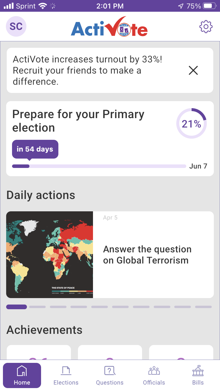
Our Model: ActiVote
After completing our user research, we determined that the ActiVote app could be a good model for ours because it is:
Nonpartisan
Educational
Gamified
Driven by simple polling and instant results
Featuring helpful data visualizations
How We Iterated on this Model
User research supported these five features, so they were in. Additionally, we simplified the FTUE to ask for a ZIP code only to lower the barrier to entry. We added sequencing to break down users’ tasks each time they visit the app. We simplified the data visualizations. We added a cheatsheet feature to summarize preferences in advance of voting. And finally, we incorporated a data journalism news feed powered by FiveThirtyEight.
Prototyping
My teammates dove into sketching once we were done with our competitive and comparative research. And after receiving my feedback based on the user research results and the needs of our two personas, they built out an extensive prototype for VoteSmart.
Due to the complexity of the subject matter, it was challenging but necessary to simplify the UI. We had a few sessions focused on reviewing the user flow together, and ensuring that our two personas had their needs met. One of my teammates worked on mocking up some color schemes toward the end of the project. This would be a great area of development for a future iteration.
Usability Testing
People really liked the idea of the app and said they’d use it when it was live.
Data visualizations needed an explanation, but once users understood them they found them valuable.
Our response: Optimized the copy and added information linksThe cheatsheet for voting was positively received, but it was hard to find for some users.
Our response: Linked to voters’ cheat sheets directly from the dashboard promptSome users asked for simplification, others liked the multiple functions of the app.
Our response: Use color highlights to help people focus on one task at a timeOne user requested a “Turbo Tax” style progress bar with more segmentation.
In the next iteration: I suggest a segmented “Prepare to Vote” status page
View Our Prototypes


Closing Thoughts
While this project was challenging, it was such a worthy one. Every single person I shared the idea or prototype with felt that this type of voting preparation support would be helpful. And during such a polarized time in our country’s history, an accessible, engaging, and nonpartisan source of political information is needed more than ever.