
The Challenge
Using design thinking, I started this redesign concept with deep user research and ended with high fidelity mock-ups for both desktop and mobile. This solo project lasted a total of two weeks.
My Tools
Miro / Affinity Mapping
Google Jamboard / Card Sorting
Whimsical / User Flows and Site Map
Figma / Wireframes and Prototype
Why World of Stones and Mystics?
Many moons ago, I was a jeweler and I worked with silver and stones. Over the course of about ten years, I became obsessed with beautiful rocks and gemstones as I learned how to cut and polish them, then set them in silver. Since then, I’ve moved on to other creative work, but I thought it would be fun to dive into the world of gems again with this hypothetical redesign project.
I chose World of Stones and Mystics in Santa Cruz, CA, because its website doesn’t do their beautiful merchandise justice or convey what it would be like to visit the store. I learned from reading their reviews that many visitors appreciated learning from the store’s owner, and loved the amazing selection in the store.
From this preliminary research, I formulated an initial How Might We statement:
How might World of Stones and Mystics provide an online experience that reflects the quality of their gemstones and is more like visiting its retail location?
What I learned from user research
There was so much that could be done to improve this website! I had a lot of initial ideas and was tempted to dive right into that part, but held back until completing my research. I chose to start with user interviews, then moved on to card sorting once I was clear on how my redesign would address user needs.
Doing the research was fascinating. I loved hearing about how users connected with stones and used them in their day-to-day lives. It was so different from my experience way back when. But after about four interviews, I realized that the users I’d spoken with so far really enjoy the experience of buying stones in person and making connections with the people who sell them. This was going to be more challenging than I’d thought.
Click to enlarge
Can an online experience compete with an in-person one?
I decided to interview five additional people for a total of nine. I added a set of questions to help me understand what could provide a positive online shopping experience for crystals and gemstones. I also added questions about positive online shopping experiences in general. In the end, I had a rich amount of information about what users appreciate in an online shopping experience and what influences their purchases, such as a large variety of products, the possibility of sophisticated search, and more in-depth information.
Turns out, these nine users had a lot in common. Some of the themes that bubbled up include:
The search for meaning and purpose behind the stones
The need for authenticity and information about ethical sourcing
The desire to connect with the owner
The power of physically interacting with stones
Price sensitivity (since these items can range dramatically in price)
Attraction to the spectacular beauty of gemstones and crystals
User Quotes
“I want to actually learn about them [crystals and gemstones] myself instead of believing what is on social media.”
“Of course, I look for a pretty, sparkly aesthetic.”
“If you’re able to talk about sourcing, that builds that trust for me.”
“On a website, I look for the ‘about me’ section. Anybody can sell crystals. I want to know their story, their experiences.”
Meet our Personas
Saundra
Saundra, a 51-year old college administrator living in Chapel Hill, NC, is deeply knowledgeable about crystals and gemstones. They are an important part of how she supports her well-being and are endlessly interesting to her. Saundra needs a better way to learn about and find rare crystals and gemstones when she wants to do so, instead of waiting for new-age and healing arts expos to come to town.
Alana
Alana, an active pre-K teacher in San Luis Obispo, CA, has recently taken an interest in the meaning and healing properties of crystals. She follows influencers on social media, but because she is so new to crystals, Alana needs a trusted source of authentic and ethically sourced stones.
My solution statement
The new worldofstonesandmystics.com provides rich, up-to-date information about the properties of crystals and gemstones, and a trustworthy shop for authentic, ethically-sourced stones.
Sites Doing It Right: Competitive and Comparative Analysis
There are so many online crystal shops. I’m sure I’ve visited at least 100 of them. Fortunately, my competitive and comparative analyses were easier to do after my user research was complete and I could focus. After learning about positive online and in-person experiences for my users, I asked myself who is…
…doing categories or filters right?
…doing photography and design right?
…doing education right?
…letting their personality shine through as a trusted source?
-
It’s very hard to find an online crystal and gemstone shop that is doing this right. There are so many ways to categorize stones and it can be very overwhelming to shop on these sites unless you know exactly what you are looking for. One exception? Newmoonbeginnings.com. Their filtering functionality rivals some of the mainstream, high-traffic websites such as Macys.com. Macy’s offers many ways to find things and has extensive merchandise, but it is very easy to filter and sort to get to exactly what you are looking for.
-
By far, wildalabaster.com was the leader in both of these categories. Their site is beautifully branded all the way through, with photography to match. I would feel much more comfortable spending good money on a gemstone on this site than on many others I’ve visited. They also take the time to describe how they source their stones ethically, which many of my users would appreciate.
-
The blog on spiralcrystals.com is enormous and has articles on many topics, but they are each short and easy to digest. They use the listicle format a lot which makes learning really easy.
-
I absolutely loved spending time on solacecrystals.com. I believe this is because the owner’s voice permeates the site. She is caring and thoughtful and likely wrote every single item description. There is a section in which you can learn more about her as well. After spending a few minutes on this site, I wanted to buy from the person who runs it.
Building out the site
Card sorting
After doing my competitive and comparative research, it was time to conduct a card sort. I decided on an open card sort to help me understand the categories my users may look for. I’m happy to report that four categories came up consistently after 5 card sorts:
Name of Stone
Type (or Shape)
Color
Intention
Site mapping
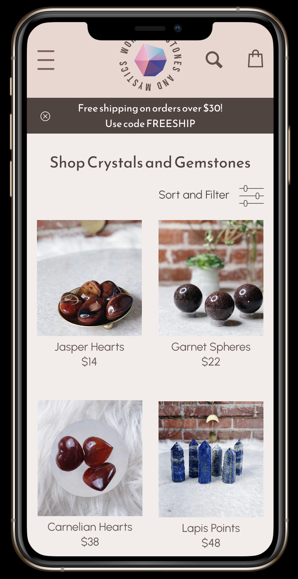
The card sorting exercise made it easy to build out my filters and sorting functionality. The rest of the site was informed by my user interviews.
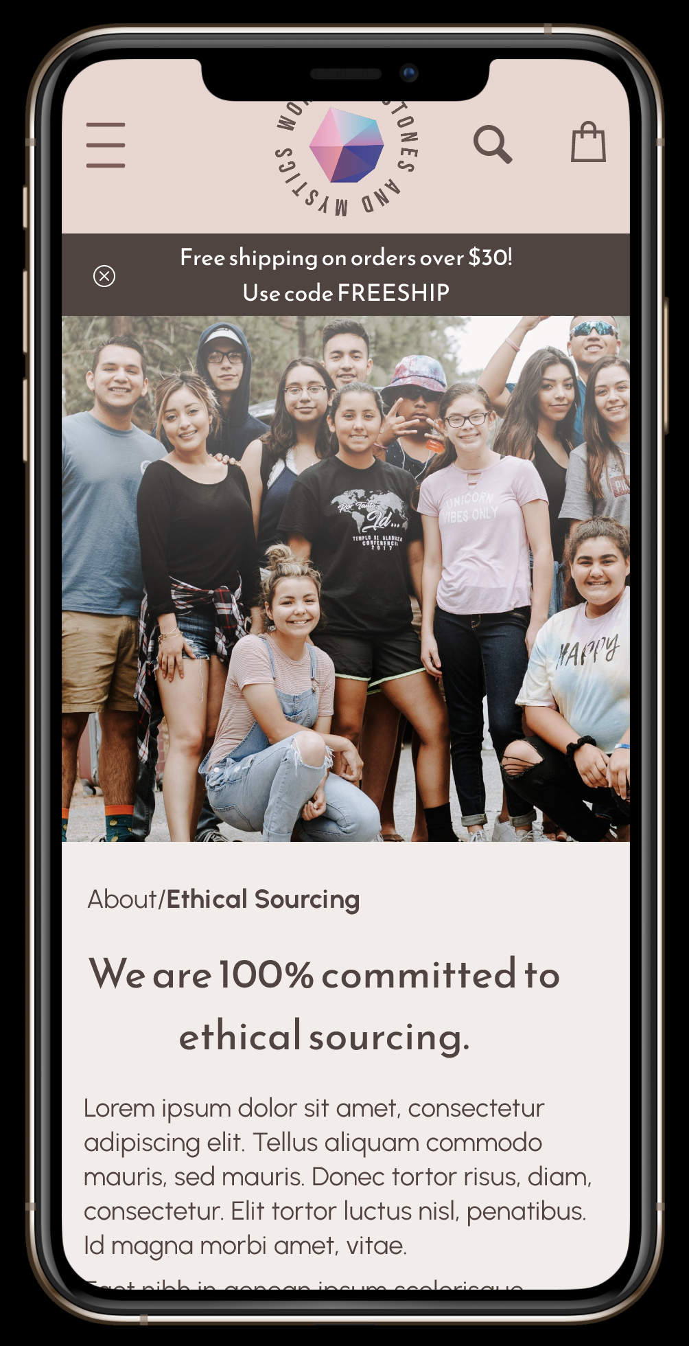
I wanted to make it easy to learn about the owner of the store since this was really important to many of my users. There is an “About” section with a page titled “About Henry” (Henry is the owner of World of Stones and Mystics).
I wanted to call out his values and his ethical sourcing practices, so there is a page entitled “Ethical Sourcing.” In addition to learning about Henry’s sourcing, you can meet some of the people he sources his stones from around the world.
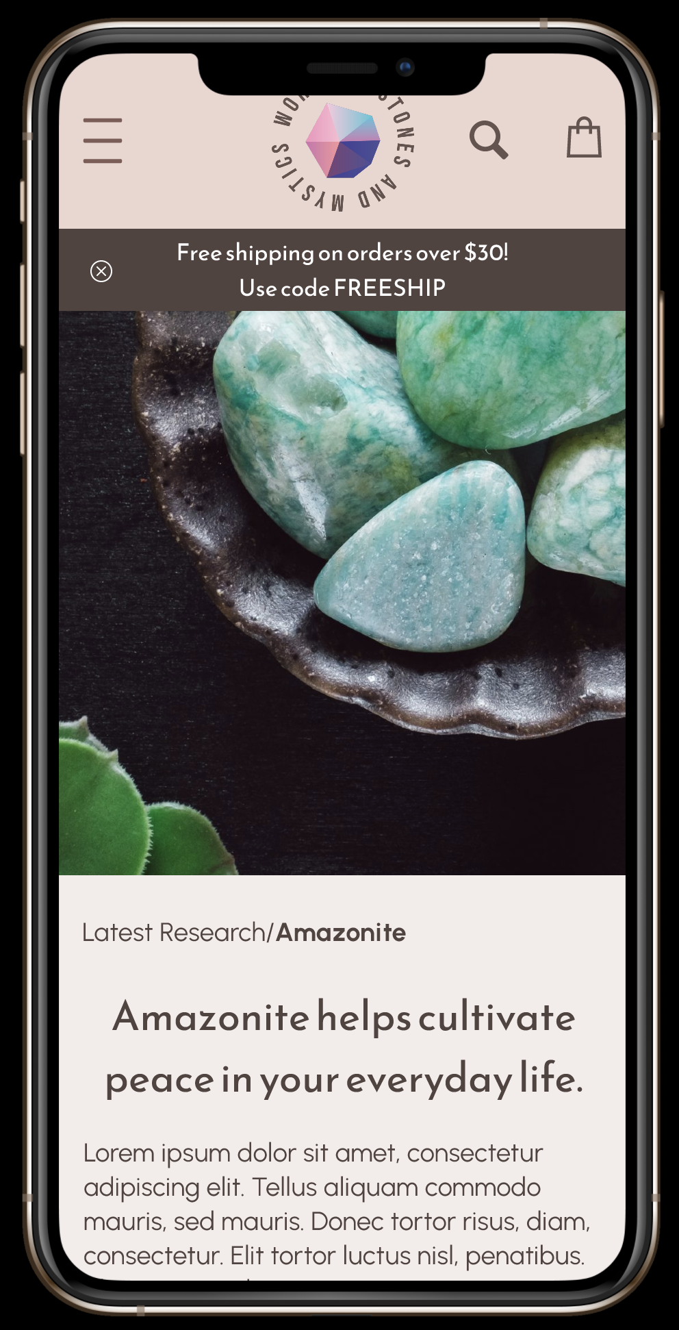
Finally, there is a blog entitled “Latest Research” in which users can learn about the latest information on the usage and the properties of gemstones and crystals.

User Flows
My personas’ user flows varied in that Saundra went straight to the latest research to get more in-depth information about crystals and gemstones, whereas Alana checked out the store’s sourcing practices before searching by intention. I also included a “Sort by price: low to high” function and a discount code for free shipping, since my users were generally concerned about price.
Low-Fidelity Prototype

Low-Fidelity Prototype Homepage (Figma)

Low-Fidelity Prototype PDP (Figma)
Usability Findings
Once I built out my prototypes for each user flow, I tested them out on five very different users. They ranged in their level of interest in crystals and gemstones, and they ranged drastically in age. With their feedback, I made the following updates to my prototype:
I enlarged the clickable areas in my “Shop” section and filters.
I retitled my original “Blog” section because one user pointed out that the word “blog” was really dated by now.
I eased off the hard sell I’d had on the home page, “Shop Selenite,” next to the article. A user didn’t want to be pushed to buy something when she was looking for information.
I added more confirmation information during the checkout process to make sure people knew everything was correct and on track.
I increased the font size in my navigation for better legibility.
Moving to High-Fidelity Mock-ups
I wanted to build a site that my users would trust when they:
Purchase high-end items from a brand that resonates with them
Seek knowledge about the healing and metaphysical properties of crystals and gemstones
Choose to buy ethically-sourced items
This means that the site is both modern and follows best practices and that it provides sourcing and certification information for its stones. I’ve learned a lot about the crystal industry since starting this project and there are many practices that are problematic and hard to identify as a consumer: from conflict stones to worker safety issues to the heavy environmental impacts of mining.
-
I started with a very light pink and dark purple after playing around with a logo design with these colors in it. Turns out, the purple took attention away from the beautiful crystals and stones featured on the site.
I decided to go with a much more natural and muted color palette after making that discovery. I used Adobe Color to find a color palette that I liked: it was based on colors found in tree bark. -
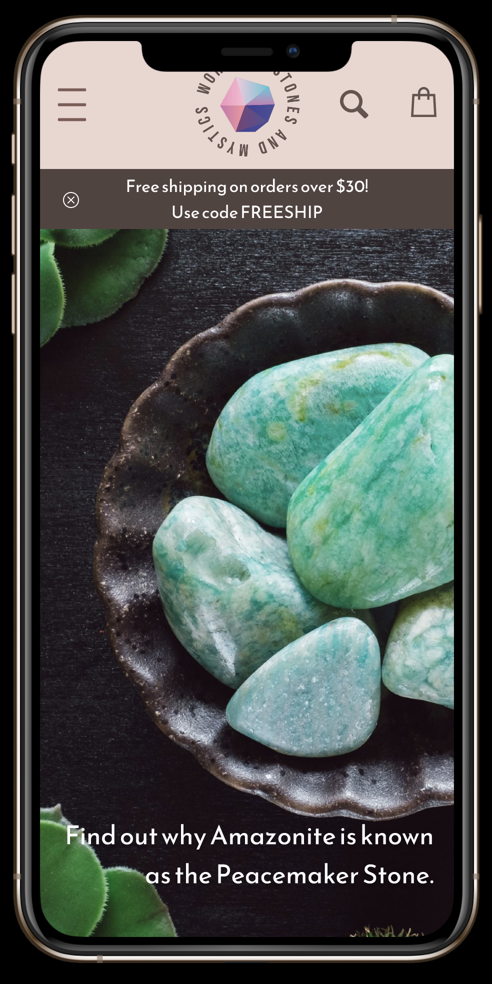
I began laying out the home page with a hero image featuring Selenite: a beautiful white and clear crystal. While the image itself was gorgeous, it ended up blending with the muted background. To address this, I found an image of Amazonite with darker, bolder colors that contrasted nicely with the background.
-
I ran an A11y accessibility check and learned two things: I needed to increase my body copy font size and I needed to provide more color contrast in my image overlays.


Closing Thoughts
I really enjoyed gaining an understanding of what consumers find helpful as they select crystals and gemstones. These choices are very personal and provide a designer with a special challenge: to provide a simple way for users to find and discover the right stone for them while sharing knowledge, building trust, and making meaningful connections.