

The Challenge
Holy Names University (HNU) is a small, private college in Oakland, California, with the mission of empowering students to make positive changes in their communities. HNU had aggressive enrollment targets, but its brand and its website were out-of-date and unable to support these goals well.
The task: Update the HNU brand and website so that they boldly reflect the identity of the community and clearly articulate the value of an HNU degree.
The team: Director of Marketing and Communications and Project Lead (me), Communications Manager, Web Manager, 160over90 agency team
The timeframe: 12 months
A Priority Project
When I took on the role of Director of Marketing and Communications at Holy Names University, it was clear to me that a brand update and website redesign would need to be my top priorities.
At that time, the site was trying to be everything to everyone and it simply didn’t meet anyone’s needs. It was cluttered, with five layers of navigation. It was supposed to serve prospective students and families, current students, faculty, and staff, as well as alumni and donors, and community members who may want to attend an event on campus or rent our facilities. It served none of these audiences well.
Our SiteImprove heat map showed us that the search bar was heavily used. We knew this was just one of many indicators that we needed to rework our site architecture and jokingly called it “the fireball.”
There were too many content owners, and the ownership wasn’t consistently updated when there was a staffing change, which led to many pages with outdated content.
It was built with Drupal 7 and we had nobody on staff who knew this platform well.
HNU’s previous website had competing navigational elements and a lack of focus.
Preliminary Research
The redesign project began with a site check-up that I worked on with a digital agency specializing in higher education. With their guidance, we performed usability testing on the current website with prospective students and parents.
As users navigated the site on desktop and mobile, we asked:
Can you find what you are looking for?
What do you like about the experience?
Does anything frustrate you about the experience?
This helped us understand their top tasks so that we could determine our key calls to action and areas of focus for the redesign. We learned that the areas most valuable to our users were admissions and academic program information and that the redesign would need to make them easier to find.
Researching best practices for higher education websites informed our decision to move content serving current students, faculty, and staff to an intranet, giving hnu.edu a sole focus: recruiting new students. An NRCCUA survey of high school students indicated that an institution’s website is their number one recruiting tool. This information helped me get buy-in when it came to moving internal content to an intranet.
Our competitive research focused on institutions with whom we competed for students: from small, private institutions to state universities. This led to a feature prioritization that informed the redesign. This research also supported our decision to prioritize the mobile experience on select pages, such as our admissions event calendar and RSVP process.
Research Methods
Brand Awareness Study
User Interviews
Stakeholder Interviews
Focus Groups
Surveys
Card Sorting
Community Forums
Discovery
Next, I worked with our agency to gather feedback from our current students about factors that influenced their decision to enroll at HNU. This, along with information from research conducted to inform our brand update (see Research Methods, right) helped us determine our site architecture and areas of content focus.
Our agency also assessed the capacity of our internal team and recommended we move from Drupal 7 to a custom WordPress website.
We focused on the following key messages for the website redesign
A personalized, private school education is affordable at HNU
The admissions process is simple and accessible
HNU’s community shows care and concern for every student
The connection to HNU’s hometown of Oakland runs deep
HNU students and alumni are dedicated to service and to social justice
Challenges that Surfaced During the Redesign

Prioritizing the audiences of prospective students and their families meant providing secondary navigation options for HNU community members (see screenshots above and below).
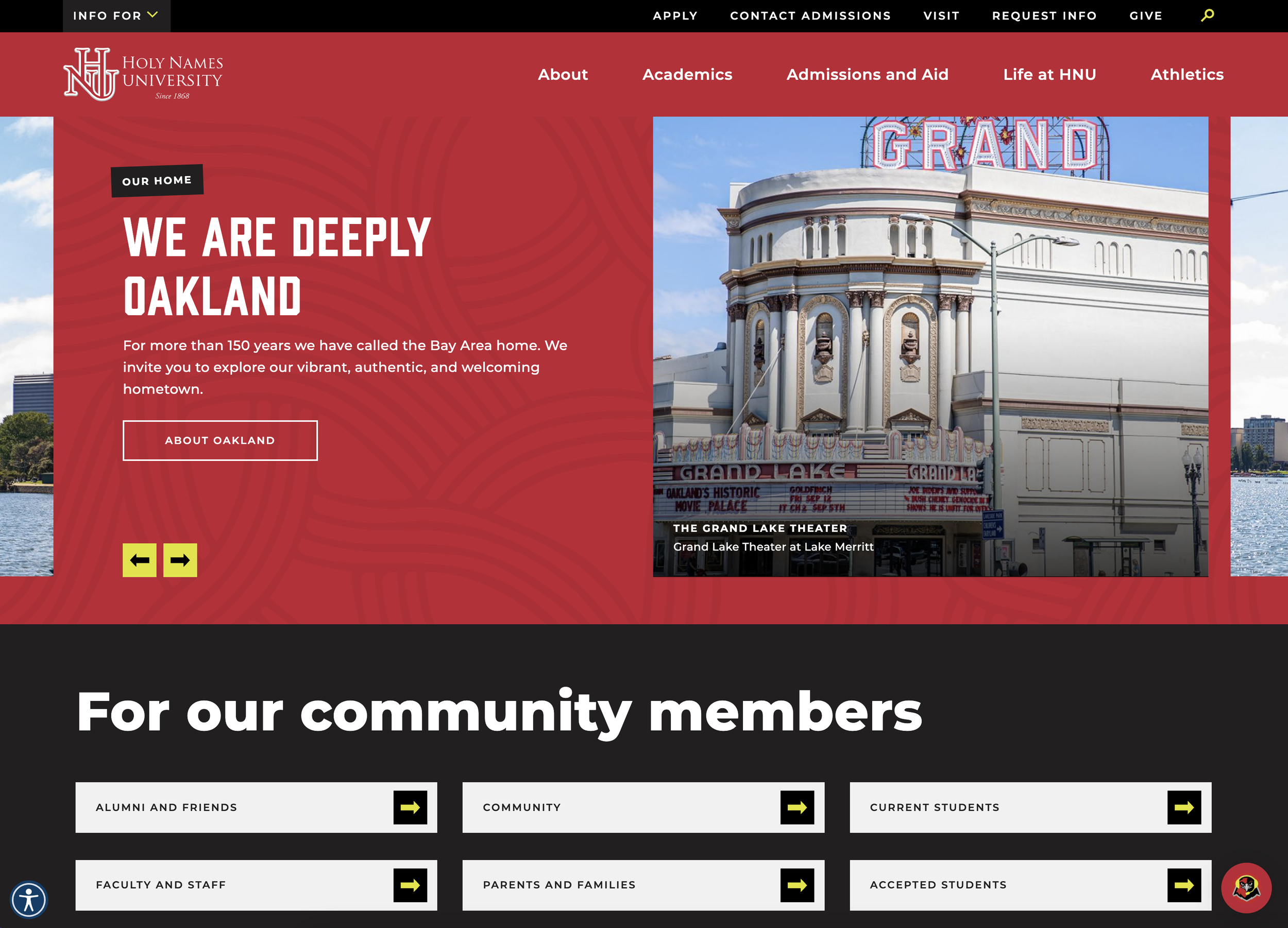
We added this links component to the home page to ensure visibility.
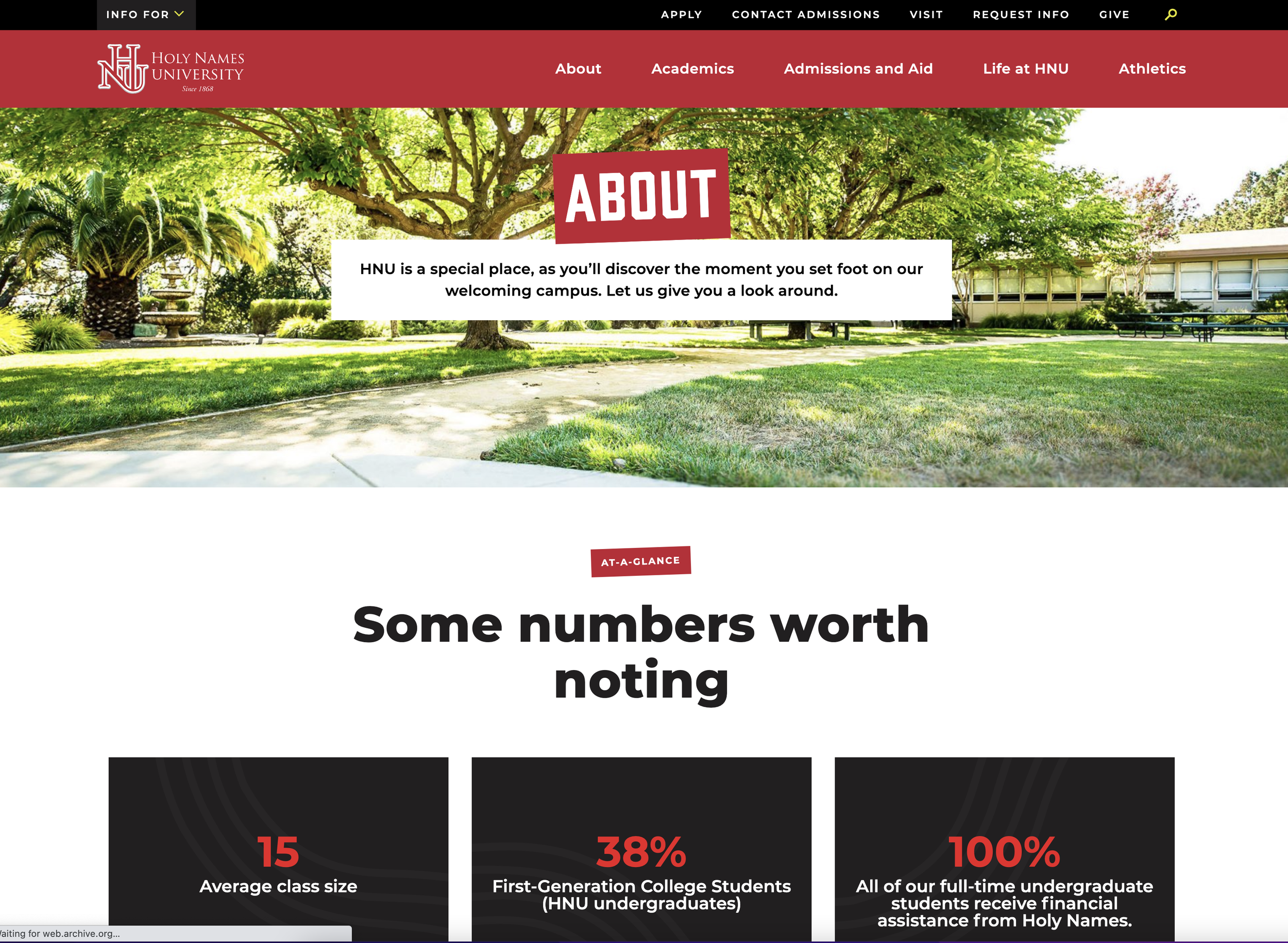
Keeping content up-to-date was challenging with limited staff, so we opted to use components we could update globally, such as this “Facts and Figures” module.
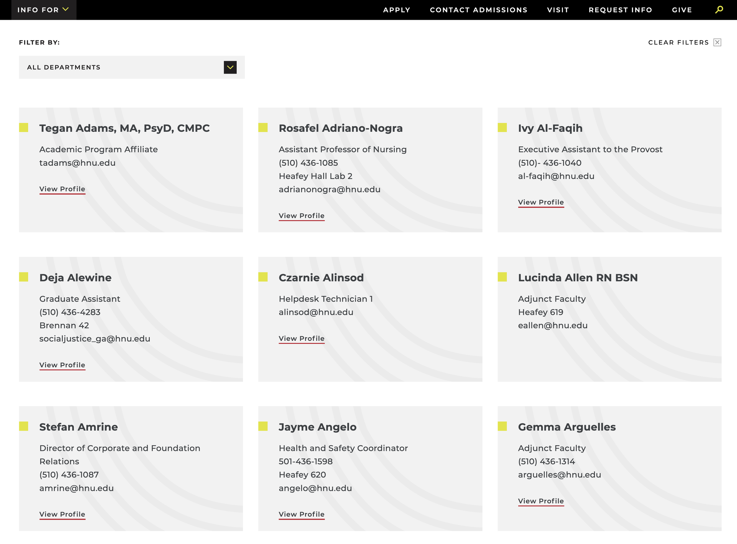
Securing photos and bios for every staff and faculty member had proved challenging for HNU. This led to a flexible card layout solution for the Directory page.
Post-Launch Research
SEO Audit: A dip in organic traffic post-launch led me to seek SEO support. After 12 months of working with our SEO partner, we saw a 32% increase in organic traffic and an increase of over 100% in form completions since before launch.
Usability Testing: With the admissions team, we built user journeys by student type and performed usability testing. This was based on top tasks, such as researching a major, finding out how much it costs to attend HNU, requesting information, RSVP-ing to an admissions event, and applying for admission.
Website Survey: For six weeks after launch, we ran a Qualtrics usability survey on our site. We were able to both uncover outstanding bugs this way and validate our design decisions.
Chat widget: Industry research showed users increasingly expect the ability to engage instantly through chat. HNU implemented an Intercom chat widget, staffed with enrollment counselors. The questions and conversations conducted via chat continually help HNU better understand what their users are looking for.
Post-Launch Learnings
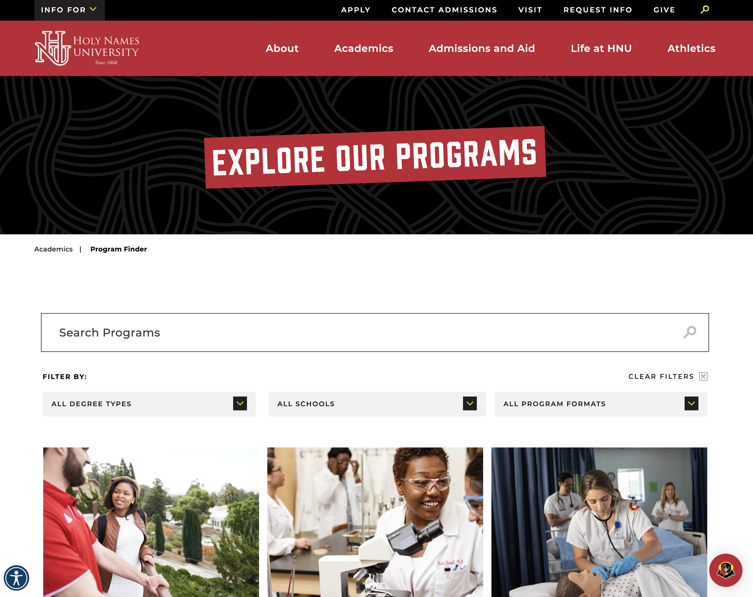
The Program Finder page provided many search options but its page visits were lower than expected. We added a Degree Programs page (below) that quickly became one of the top five most visited pages.
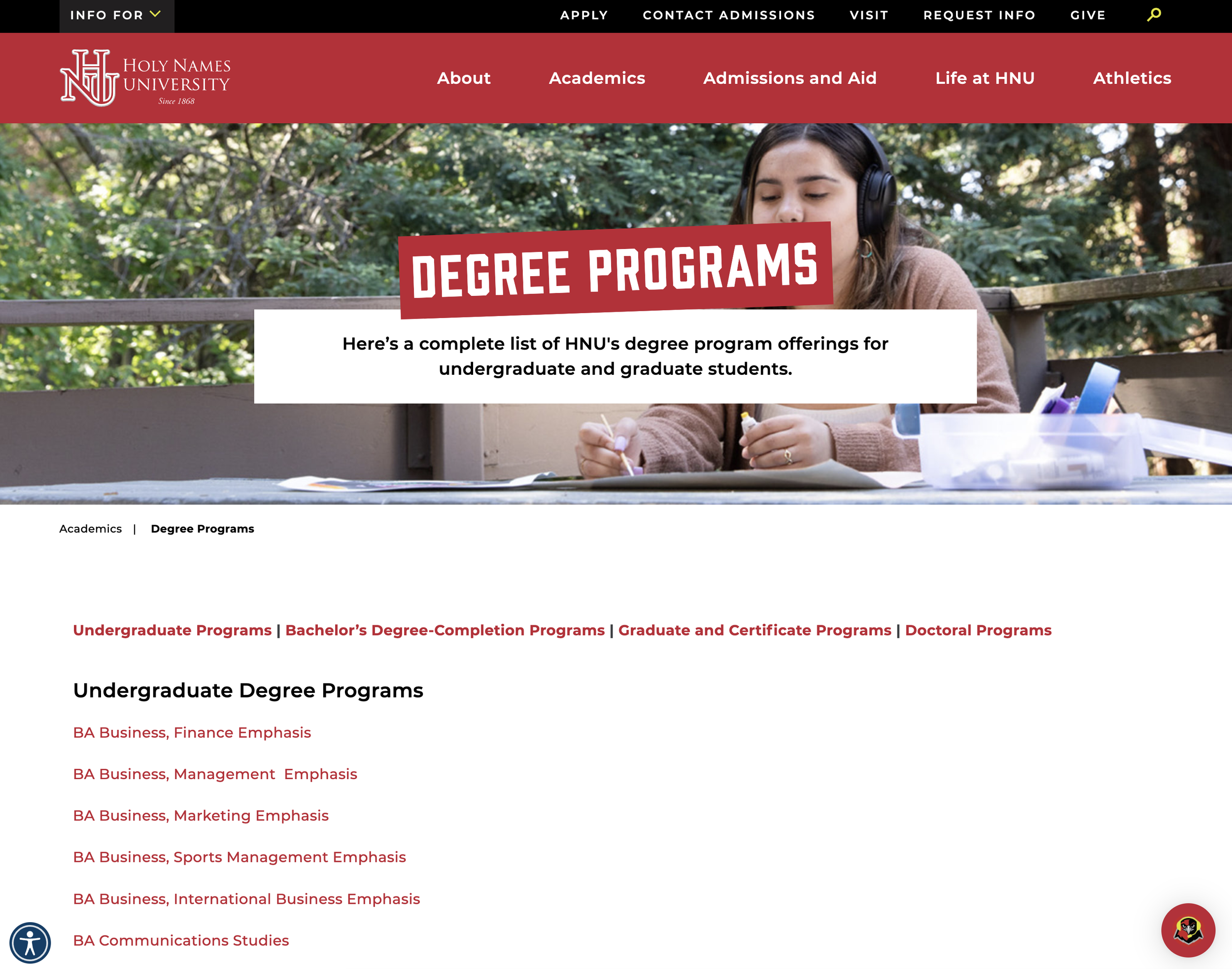
Google Analytics showed that the new Degree Programs page was preferred by users.
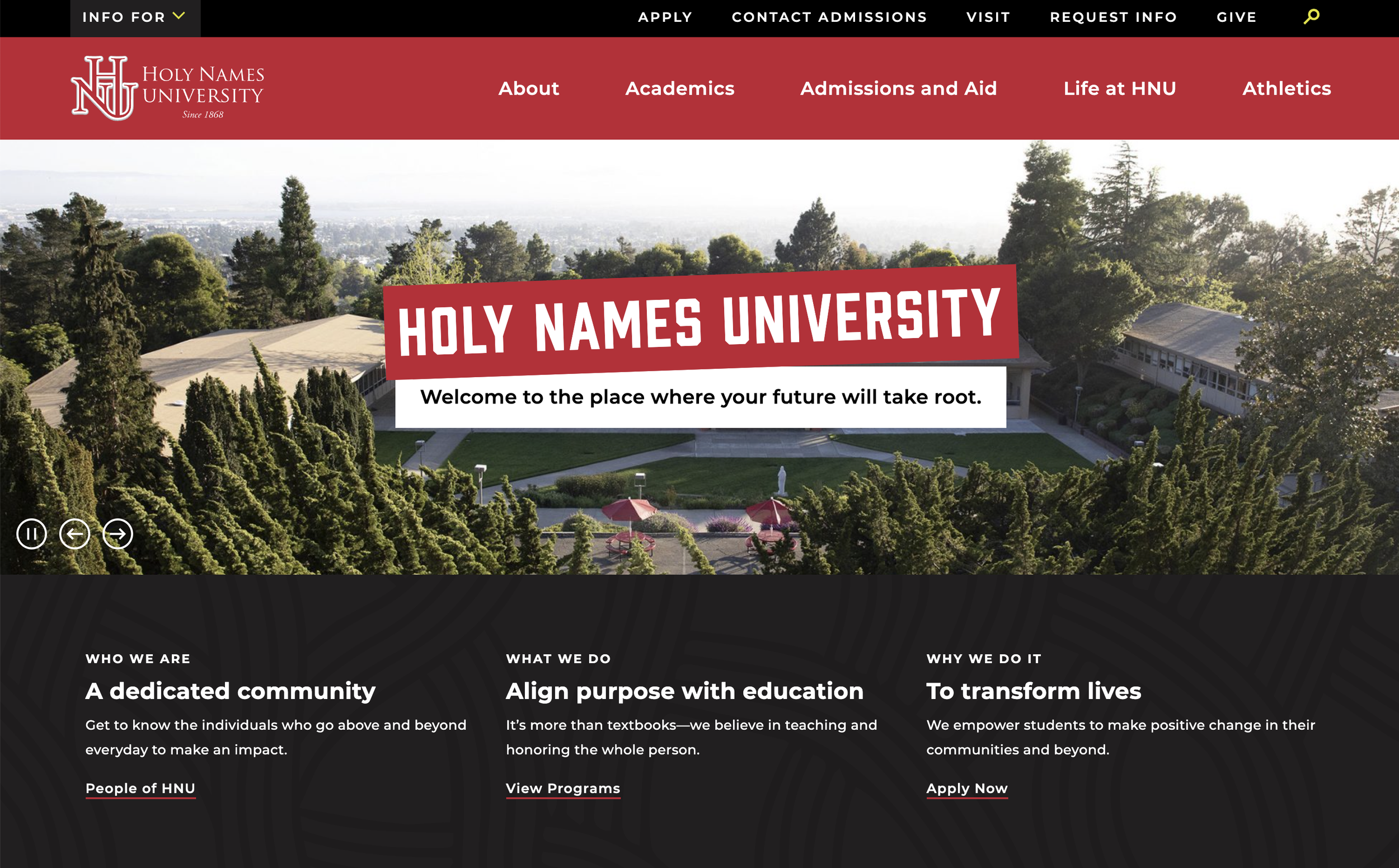
We launched with a video on the home page of HNU’s Rite of Passage event, but it negatively affected our page load time, so we ultimately replaced it with an image slider.
HNU had just instituted academic schools when we began our project, so we categorized a lot of information by school (e.g. academic programs, staff directory). Post-launch, we observed that people weren’t searching for information by school, so we provided alternative ways to access the information.
Tools
Zoom, SiteImprove, Slickplan, WordPress, Slate CRM, Google Analytics, Qualtrics, Intercom
Closing Thoughts
User and industry research combined with findings from HNU’s comprehensive rebrand guided all of our decisions during this site redesign. Analytics show meaningful increases in users (e.g., a 32% increase in organic traffic) and engagement (e.g., a 100%+ increase in form completions). We now feel confident that the site reflects Holy Names University’s community and values, and welcomes the students who will thrive on its campus and beyond.